iOS Version of Student App

Here’s the link to the iOS version of my CU dashboard app: https://www.figma.com/proto/ZjXBEIgXHnOVxl5map4iDg/iOS-14-GUI-Dark—Design-Files?node-id=29%3A7524&scaling=scale-down

This exercise really made me learn Figma, which was honestly a bit frustrating, although I feel that I’m better off after doing so. Using premade components was a challenge, but a very interesting one. The thought process the goes into assembling an interface from scratch vs. from premade components couldn’t be more different. When constructing a bespoke interface, I often get tied down in the aesthetics of creating the layout, while when assembling from premade components, UX concerns take center stage.

iOS Article Responses

Article 1: UI Design Dos and Don’ts (Apple Developer)

In typical Apple style, this guide offers simple advice in an elegant way. All of the topics discussed here are known by every good designer. The real innovation lies in how pure Apple’s implementations of these fundamentals are. Each example is effective and easily understandable. It’s also helpful to have some of the more firm guidelines to use as rules of thumb, such as “text should be at least 11 points” and click targets should be “at least 44 points x 44 points”.

Article 2: iOS 13 Design Guidelines: An Illustrated Guide (Erik Kennedy)

In this article, developer Erik Kennedy details the methods and implementations that make the iOS examples from the previous article looks so graceful. The most interesting part of this article to me was the “squircle” icon. The generally idea of this is that instead of using a simple rounded rectangle, Apple updated their icon shape to be slightly more gently curved into the straight parts of the square. Looking at a rounded rectangle vs. a squircle, it’s difficult to tell whether the squircle looks better. I will say though that when designing icons in the past, something about the rounded rectangle has always felt a bit odd to me, as if I was missing some crucial element that would make it feel like iOS.

Another interesting piece from this article is the hierarchy of nav bar “rows”. This refers to a series of four rows starting from the top of the device that all have a clearly defined functionality and presentation in iOS. The purposes of each of these objects, and the ways they respond to user interaction are fascinating.

School Interface Design Challenge

https://www.figma.com/proto/9nXKLkKswuWDD8qSqyiJTZ/Untitled?node-id=1%A4&scaling=scale-down

The primary challenge with this layout was clearly the amount and variety of material that had to be included. My solution to this was to expand my layout beyond the vertical edges of the screen with a scrolling layout to take advantage of consistency and continuation. Beyond this, I also grouped related pieces of information, such as announcements and shared pictures. This layout generally follows the F pattern, since most content is aligned to the left side of the screen, and information is laid out from top to bottom in decreasing order of relevance. I used a common header to consistently indicate changes in category of information.

Visual Hierarchy In Real Interfaces

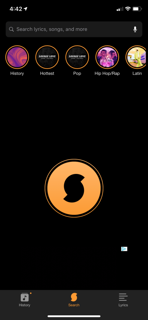
This app, SoundHound, listens to audio from its surroundings and determines what music is playing. This function is the primary function of the app, and is thus laid out directly in the middle of the page. This button for this function (the circle with the S logo) is bright orange, contrasting well with the dark background. Finally the secondary functions of the app, like history, genre information, and lyrics, are positioned at the top of bottom of the screen in small menu bars. Overall, this layout does a fantastic job of highlighting the core functionality of the app without neglecting secondary functions.

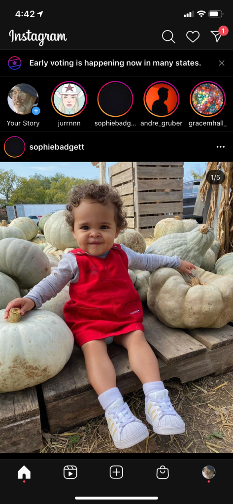
Instagram’s new layout is chaotic and confusing, owing largely to poor visual hierarchy. The primary problem I have with this layout is the overuse of accent colors. Here, orange/red is used to signify new stories, early voting, a direct message, and user who posted a photo who also has a store. If it sounds that confusing to say, it’s probably to much to be using a common signifier for! All the accents distract the eye, and would likely confuse a user with little prior familiarity with the app.

Sprint Process and Interface Taste

Although I was familiar with a majority of the process described in the video, breaking it down into Acts seems useful. As mentioned in the video, I am always eager to show my prototype to a tester, and often neglect to get information on the user’s background, which ultimately colors the entire interview. I also appreciated the emphasis on ensuring the tester didn’t feel like they were being tested – this makes people clam up and can undermine the usefulness of a whole interview.

As for favorite interfaces, I’m a big fan of Slack. The app contains a massive amount of information – contacts, messages, alternate threads, etc., and manages to organize it into an extremely usable format. I especially like the multi pane layout seen above. The ability to adapt to screen size and the user’s needs is very valuable.

Scheduling App Draft Phase

Our app streamlines scheduling social events by synchronizing pre existing calendars and presenting times when all members are free.

Users/Persona:

Name: Drew

Age: 20

Occupation: Student

College Junior majoring in computer science. Recently assigned a group for a project in his software development class. All of the group members have a lot on their plate and finding a time to meet is often a lot of work and a frustrating process. 

Name: Naomi 

Age: 31

Occupation: Internet Journalist

Naomi has a busy group of friends who struggle to find a time to meet up. Work schedules and commute times make it difficult to find times that work for everyone. Extensive coordination attempts are frustrating for all parties involved.

Job to be done:

  • Issue: People have a hard time scheduling in groups, even among friends. There are often too many schedules and preferences to efficiently plan, which can lead to frustration (or even worse, growing apart and not seeing friends)
  • Question: How might we eliminate the frustrations of coordinating plans with multiple people?
  • Solution: An app that integrates with google calendars, and allows people to pick their top free times within a date range, and then spits out a time that works for everyone (+ dynamically adds it to your google calendar).

Box and Whisker Diagram: https://www.figma.com/proto/CoIHPxC2N9Ujj79L0Xp4qE/Scheduling-App?node-id=1%3A4&scaling=scale-down

Reflection on process so far: So far I am enjoying this process a lot. My other group members are both engaged and easy to work with, and our prototype is coming along well so far. Creating the box and whisker plot seems to be a valuable step before going into prototyping – I have impatiently skipped this stage before and regretted it later.

Pro Figma

For my second foray into Figma, I decided to develop an app concept that I came up with for another class. The core idea is a simple quiz app aimed at senior citizens who can’t leave their homes to socialize as they normally would. Working with a target audience that is less comfortable with technology is an interesting design challenge. I decided to use Facebook for account creation, since many seniors use Facebook and it would be more likely to be intuitive for them. I also added a feature that adds friends from contacts, to ease networking.

Working with Figma was a smoother process this time. Creating common assets greatly sped up my prototyping, and copy and pasting groups of graphics across slides helped align objects from slide to slide.

The only major issue I ran into was some text on my “add friends” screen mysteriously didn’t render.

Figma First Impressions

I like Figma a lot already. Most of all, I’m glad a majority of my illustrator knowledge transfers over – this really lowered my learning curve. Additionally, it seems like some drastic improvements on Illustrator’s general UI have been made. For example, the layers menu is easier to access and manipulate, and the “constraints” are much more intuitive than Illustrator’s unpredictable snaps.

It seems like Figma isn’t designed for in depth graphic design like vector illustration or logos, so I don’t have any questions about this stuff just because I don’t intend to do much of it in Figma. I am currently not sure how to set a home screen in Figma though, since the screen I created first this way wasn’t set as a default. I am also curious about exporting frames as .png (or other image types), since the export menu seems a bit limited for this.

Here is a super silly proto-prototype I made as a method for learning figma: https://www.figma.com/file/bsVxDvVIkdBqFFX388klUw/No-Cursing?node-id=0%3A1

Here is another more serious demo I made after I got that out of my system: https://www.figma.com/proto/4MRYndlrjFlgDd87hvkkeJ/Cat-Adoption?node-id=1%3A2&scaling=scale-down

The “Purple” Iteration Process

Pertaining to a chapter from Ken Kocienda’s book, “Creative Selection”

Ken’s experience with early touch screen keyboard development is a fascinating example of iteration and the design process. Ken and the other designers on the purple team have a once in a lifetime design problem before them: how should can a keyboard be ported from a large medium to one a tenth the size? Simply shrinking down a traditional layout doesn’t work, so there’s no immediately obvious solution. At this point, the team shifts to rapid iteration. Each programmer works on their own idea for the keyboard, presents a demo version, receives criticism from the rest of the team, and then goes back to the drawing board. The team repeats this process until Ken finally develops a keyboard that uses a dictionary predictive algorithm to optimise typing.

The most significant part of Ken’s discussion of this process is the difference in usefulness between a vague demo and a concrete one. In Ken’s opinion, the value of a demo is in its ability to simple portray and test a concept. When a demo is vague, or marginally functional, both of these aspects are fundamentally compromised, and therefore the demo is useless. The only reason that the purple team was able to decide on Ken’s final solution is the efficiency of his demo, which they used to test his keyboard. Marginal demos are common though, and there is a reason for this: the natural desire to avoid committing a lot of energy to a task that might be fruitless. I have struggled with this myself in the iteration process before; in sketching my ideas are many and varied, but once it comes time to begin prototyping, I often to commit to a single concept, for better or for worse. In the future, I will remain mindful of the value of a “concrete and specific” prototype.