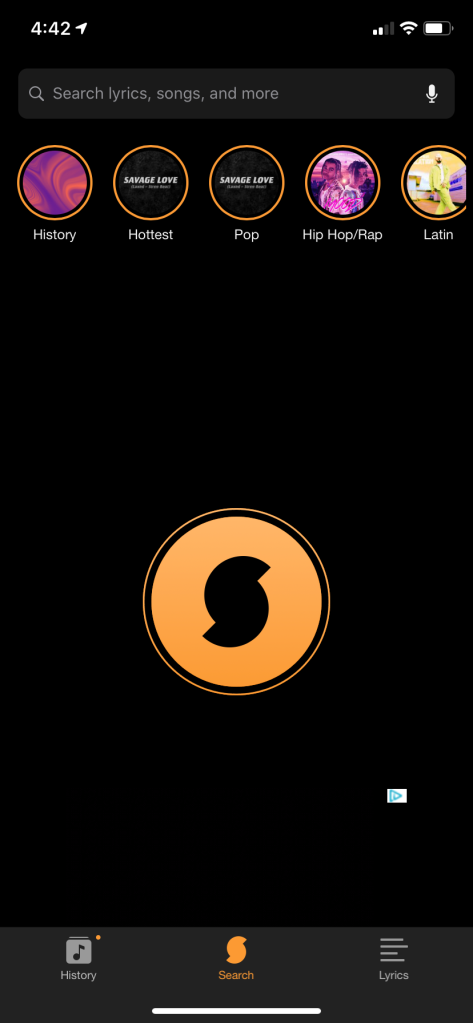
This app, SoundHound, listens to audio from its surroundings and determines what music is playing. This function is the primary function of the app, and is thus laid out directly in the middle of the page. This button for this function (the circle with the S logo) is bright orange, contrasting well with the dark background. Finally the secondary functions of the app, like history, genre information, and lyrics, are positioned at the top of bottom of the screen in small menu bars. Overall, this layout does a fantastic job of highlighting the core functionality of the app without neglecting secondary functions.
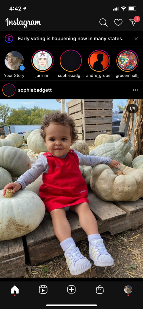
Instagram’s new layout is chaotic and confusing, owing largely to poor visual hierarchy. The primary problem I have with this layout is the overuse of accent colors. Here, orange/red is used to signify new stories, early voting, a direct message, and user who posted a photo who also has a store. If it sounds that confusing to say, it’s probably to much to be using a common signifier for! All the accents distract the eye, and would likely confuse a user with little prior familiarity with the app.
